Molecules are more complicated web components formed by combining Atom components together. Molecules typically include blocks, functional components, and navigation elements.
Blocks
Blocks tend to be non-functional components that are visually distinct from the normal body content.
Default Block
The Default block is a flexible pattern that can be used with almost any HTML content. Optionally, the default block can have an accent style added through the "block_default_accent" parameter. If set to "true," the accent will be added to the left border of the default block.
Lorem ipsum dolor sit amet, consectetur adipiscing elit, sed do eiusmod tempor incididunt ut labore et dolore magna aliqua.
Copied!
Blocks
{% block block_content %}: The HTML content to appear in the block.
Parameters
block_default_classes: Additional block classes.
block_default_id: Block ID.
block_default_accent: Optional accent on the left of the block.
Options: true, false (Default).
block_default_attributes: Optional additional attributes for the block.
Block Utilities
Similarly to buttons, NDS provides utility classes for blocks. These block classes will override default stylings of block components:
block-nds--border - Block with a border.
block-nds--shadow - Block with a shadow.
block-nds--no-style - Block with no additional style (looks like plain content).
Search Result
The Search Result pattern can be used to display a set of results returned by your search engine. NDS also provides special styling for document-based results.
block_search_chips_data: An array of search chip objects.
Structure: {"text": "", "url": ""}. The URL should be the link to remove the chip.
block_search_chips_clear: A URL hooked to the clear button that removes all search chips.
Includes
Atoms -> Buttons -> button-default
Atoms -> Text -> text-chip
Featured Content Card
Featured Content Cards are useful blocks designed to highlight your most important content. Each feature includes a title, an image, and a short description of the content.
block_featured_content_card_src: The path to the featured image.
block_featured_content_card_alt: Alt text for the featured image.
block_featured_content_card_title: Title of the featured card.
block_featured_content_card_title_link: Optional URL for the linked title.
block_featured_content_card_description: Featured card description.
block_featured_content_card_featured: Optional text that appears above the title (ex. FEATURED).
Includes
Atoms -> Images -> image-default
Alert Block
Alerts are used to display important, need to know information to site users. NDS offers four alert severity blocks. Alerts are only for high priority messaging that requires immediate notification. Only one alert can show at any time.
{% block block_alert_content %}: The alert HTML content.
Parameters
block_alert_classes: Additional alert classes.
block_alert_id: Alert ID.
block_alert_severity_level: The alert severity level.
Options: "1" (Default), "2", "3", "4".
Status Message Block
Status messages are used to convey important information to users. There are four types of status messages - success, information, warning, and error:
Success - Indicates a user has completed an important step or call to action.
Information - Calls out an important snippet of information a user could find useful at-a-glance.
Warning - Slows a reader down if skimming through the content. Indicates the user may need to take action before moving on.
Error - Used in rare cases where a user should stop reading or moving forward and take additional action.
Lorem ipsum dolor sit amet, consectetur adipiscing elit, sed do eiusmod tempor incididunt ut labore et dolore magna aliqua. Malesuada bibendum arcu vitae elementum curabitur vitae.
Lorem ipsum dolor sit amet, consectetur adipiscing elit, sed do eiusmod tempor incididunt ut labore et dolore magna aliqua. Malesuada bibendum arcu vitae elementum curabitur vitae.
Lorem ipsum dolor sit amet, consectetur adipiscing elit, sed do eiusmod tempor incididunt ut labore et dolore magna aliqua. Malesuada bibendum arcu vitae elementum curabitur vitae.
Lorem ipsum dolor sit amet, consectetur adipiscing elit, sed do eiusmod tempor incididunt ut labore et dolore magna aliqua. Malesuada bibendum arcu vitae elementum curabitur vitae.
Lorem ipsum dolor sit amet, consectetur adipiscing elit, sed do eiusmod tempor incididunt ut labore et dolore magna aliqua. Malesuada bibendum arcu vitae elementum curabitur vitae.
Lorem ipsum dolor sit amet, consectetur adipiscing elit, sed do eiusmod tempor incididunt ut labore et dolore magna aliqua. Malesuada bibendum arcu vitae elementum curabitur vitae.
Lorem ipsum dolor sit amet, consectetur adipiscing elit, sed do eiusmod tempor incididunt ut labore et dolore magna aliqua. Malesuada bibendum arcu vitae elementum curabitur vitae.
Lorem ipsum dolor sit amet, consectetur adipiscing elit, sed do eiusmod tempor incididunt ut labore et dolore magna aliqua. Malesuada bibendum arcu vitae elementum curabitur vitae.
Copied!
Blocks
{% block block_status_message_content %}: The status message HTML content.
Parameters
block_status_message_classes: Additional status message classes.
block_status_message_id: Status message ID.
block_status_message_type: The type of status message (required).
block_status_message_attributes: Additional status message attributes, used particularly if these messages appear dynamically.
Includes
Atoms -> Icons -> icon-default
Hero Block
The Hero Block can be used to add substantial visual interest to web pages. The pattern features a parallax effect courtesy of the Materialize library.
When selecting imagery for the Hero block, we recommend images that do not feature people and faces. Due to the responsive requirement of websites today, using people-based images could result in faces being occluded or cut off on various screen sizes. NDS recommends pattern-based imagery or imagery with simple subjects.
The Hero Block pattern optionally includes the ability to add breadcrumbs to the top.
Dependencies:
In order to leverage the full capabilities of this component, you must include the following libraries in addition to the NDS Global JS:
Materialize
Copied!
Overview
The Hero Block pattern requires developers to pass images to "block_hero_image" as a block statement. Refer to the demo pattern for an example.
Blocks
{% block block_hero_image %}: The hero image, passed in as a <img> tag.
Parameters
block_hero_classes: Additional hero classes.
block_hero_id: Hero ID.
block_hero_overlay_color: An optional class used to apply a color to the hero overlay. This class must contain a background color with an opacity less than 1.
Share Block
The Share Block component is a collection of Share Buttons for various social media platforms.
Copied!
Overview
The Share Block component uses a loop to render the Share Buttons. Pass data to the "block_share_data" parameter to generate each button.
Parameters
block_share_classes: Additional block classes.
block_share_id: Block ID.
block_share_data: An array of share button objects.
Structure: {"type": "", "href": "", "ariaLabel": ""}. The type is the name of the social media platform in lowercase form (ex. x-twitter).
Includes
Atoms -> Buttons -> button-share
Was This Page Helpful? (WTPH) Block
Users of NDS frequently have a need to solicit feedback on webpages from their users. NDS provides a mechanism to collect this data with the Was This Page Helpful? Block component. Please note that this component does not have any built-in form or data-collection functionality, meaning users will need to add their own functions and input handling.
Was This Page Helpful?
Was This Page Helpful?
Copied!
Parameters
block_wtph_classes: Additional block classes.
block_wtph_id: Block ID.
Includes
Atoms -> Buttons -> button-default
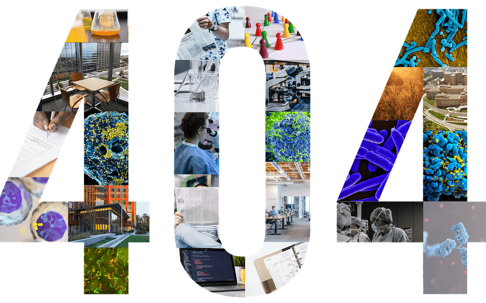
Error Block
The error block is used predominately as a display for 404 and 403-type errors. It includes two block regions for full content customizability.
The page you’re looking for isn’t available.
It's possible that the page is temporarily unavailable, has been moved, renamed, or no longer exists.
{% block block_error_image %}: A block to include an image, the default of which is the 404 or 403 NDS image.
{% block block_error_content %}: A block for the error content and instructional text.
Parameters
block_error_classes: Additional block classes.
block_error_id: Block ID.
block_error_img_src: The path to an optional image. Default: "global/misc/404.png"
block_error_img_alt: The alternative text associated with the image. Default: "404"
Includes
Atoms -> Images -> image-default
Atoms -> Buttons -> button-default
Event Block
The Event Block is a component that allows users to present an event in a block format. The Event Block optionally supports a heading, date, link, and description.
block_event_classes: Additional classes for block wrapper.
block_event_day: Text to indicate the day of the event.
block_event_month: Text to indicate the month of the event.
block_event_link_text: Heading text to label the block.
block_event_link_href: URL destination for the event block.
block_event_description: A description of the event.
Includes
Atoms -> Text -> text-date
Atoms -> Links -> link-default
Components
Components typically include functionality that adds interactivity and improved usability to websites.
Accordion Component
Accordions are web components that separate a large amount of content into sections that can be toggled open or closed, thereby reducing the overall page length and allowing the user to focus on individual pieces of content at a time.
Dependencies:
In order to leverage the full capabilities of this component, you must include the following libraries in addition to the NDS Global JS:
A: Lorem ipsum dolor sit amet, consectetur adipiscing elit, sed do eiusmod tempor incididunt ut labore et dolore magna aliqua.
A: Lorem ipsum dolor sit amet, consectetur adipiscing elit, sed do eiusmod tempor incididunt ut labore et dolore magna aliqua.
A: Lorem ipsum dolor sit amet, consectetur adipiscing elit, sed do eiusmod tempor incididunt ut labore et dolore magna aliqua.
A: Lorem ipsum dolor sit amet, consectetur adipiscing elit, sed do eiusmod tempor incididunt ut labore et dolore magna aliqua.
A: Lorem ipsum dolor sit amet, consectetur adipiscing elit, sed do eiusmod tempor incididunt ut labore et dolore magna aliqua.
A: Lorem ipsum dolor sit amet, consectetur adipiscing elit, sed do eiusmod tempor incididunt ut labore et dolore magna aliqua.
Copied!
Overview
The Accordion pattern is simply a wrapper for Bootstrap's accordion markup. Please reference the demo or Bootstrap's Collapse Documentation for more information.
Blocks
{% block component_accordion_content %}: The Bootstrap markup for accordions.
component_branding_href: URL for the logo (Default: "/").
component_branding_logo_src: Path to the logo image (Default: "global/niaid/logo-niaid.svg").
component_branding_logo_alt: Alternative text for the logo (Default: "NIAID Logo").
component_branding_logo_mobile_src: Path to the logo image for mobile displays (Default: "global/niaid/logo-niaid-mobile.svg").
component_branding_logo_mobile_alt: Alternative text for the mobile logo (Default: "NIAID Logo").
component_branding_identity_top: The top line of the product identity (name).
component_branding_identity_bottom: The bottom line of the product identity (name).
Includes
Atoms -> Images -> image-default
Atoms -> Text -> text-product-identity
USWDS Banner Component
The USWDS Banner component helps assure users that the site they are visiting is an official government site. This banner is placed at the very top of website pages.
Full-width callouts can be used to emphasize a single, important piece of information for users and encourage them to take action.
NIAID Mpox Research Role
NIAID played a key role in the available preventive mpox (formerly monkeypox) vaccine as well as treatments that may be used. NIAID continues to conduct research to better understand mpox transmission and disease.
NIAID played a key role in the available preventive mpox (formerly monkeypox) vaccine as well as treatments that may be used. NIAID continues to conduct research to better understand mpox transmission and disease.
NIAID played a key role in the available preventive mpox (formerly monkeypox) vaccine as well as treatments that may be used. NIAID continues to conduct research to better understand mpox transmission and disease.
NIAID played a key role in the available preventive mpox (formerly monkeypox) vaccine as well as treatments that may be used. NIAID continues to conduct research to better understand mpox transmission and disease.
{% block component_full_width_callout_image %}: Content to appear at in the image area, used to overrive the use of Atoms -> Images -> Responsive Image.
component_full_width_callout_texture: Determines whether a texture appears as an overlay in the background.
Options: "enabled", "disabled".
component_full_width_callout_heading: An optional title.
component_full_width_callout_body: Optional text to in the body.
component_full_width_callout_link_href: Optional URL for the link.
component_full_width_callout_link_text: Optional text for the link.
component_full_width_callout_image_data: Image sizes stored in a single variable, use an array to parse through this variable.
Includes
Atoms -> Images -> image-responsive
Media Component
The Media component makes it easy to include credits and captions with your images. Additionally, you can control the float (left or right placement) of your images.
Dependencies:
In order to leverage the full capabilities of this component, you must include the following libraries in addition to the NDS Global JS:
Materialize
This is an image caption.
Credit:NIAID
This is an image caption.
Credit:NIAID
Copied!
Overview
If you would like to include the lightbox from Materialize, you must include the Materialize script and pass "yes" to the component_media_lightbox parameter.
Blocks
{% block component_media %}: The media (usually an image) to be presented.
Parameters
component_media_classes: Additional media component classes.
component_media_src: Path to the image.
component_media_alt: Alternative text for the image.
component_media_caption: Optional caption text to appear below the image.
component_media_credit: Optional credit text to appear below the image.
component_media_credit_label: The label to appear before the credit text (Default: "Credit:").
component_media_float: The direction to float the component (optional).
Options: "left", "right", "full" (100% width of body content).
component_media_lightbox: A parameter to determine if the image should include the Materialize lightbox feature.
Options: "yes".
Includes
Atoms -> Images -> image-default
Atoms -> Text -> text-image-credit-caption
Modal Component
Modals are windows that open up over the rest of a page's content. Modals are typically used to gather user input or to alert users of pressing information.
Dependencies:
In order to leverage the full capabilities of this component, you must include the following libraries in addition to the NDS Global JS:
4
Modal Title
Modal Content
Modal Title
Modal Content
Copied!
Blocks
{% block component_modal_header %}: Content to appear at the top of the modal (ex. Modal title).
{% block component_modal_content %}: The main content to appear within the modal.
{% block component_modal_footer %}: Content to appear at the bottom of the modal.
Parameters
component_modal_trigger_classes: Additional classes on the wrapper around the modal trigger (ex. button).
A process list displays the steps or stages of important instructions or processes.
Start a process
Lorem ipsum dolor sit amet, consectetuer adipiscing elit. Morbi commodo, ipsum sed pharetra gravida, orci magna rhoncus neque.
Lorem ipsum dolor sit amet, consectetuer adipiscing elit. Morbi commodo, ipsum sed pharetra gravida, orci magna rhoncus neque, id pulvinar odio lorem non turpis.
Nullam sit amet enim. Suspendisse id velit vitae ligula volutpat condimentum.
Aliquam erat volutpat. Sed quis velit.
Proceed to the second step
Lorem ipsum dolor sit amet, consectetuer adipiscing elit. Morbi commodo, ipsum sed pharetra gravida, orci magna rhoncus neque, id pulvinar odio lorem non turpis. Nullam sit amet enim. Suspendisse id velit vitae ligula volutpat condimentum. Aliquam erat volutpat. Sed quis velit. Nulla facilisi. Nulla libero. Vivamus pharetra posuere sapien.
Complete the step-by-step process
Nullam sit amet enim. Suspendisse id velit vitae ligula volutpat condimentum. Aliquam erat volutpat. Sed quis velit. Nulla facilisi. Nulla libero. Vivamus pharetra posuere sapien.
Copied!
Overview
This pattern can be used to generate process lists to create a clear hierarchy and help users easily differentiate between individual steps or stages in a process.
Parameters
component_process_list_classes: Additional process classes.
Options: {"class": "component--process-list__numbered"} for process lists that need to be numbered.
component_process_list_id: Process ID.
Toast Component
Toasts are short, ephemeral messages that are used to inform users of timely events, such as when their actions have been processed successfully or when an error has occurred. Toasts are automatically dismissed after a few seconds. If you require more active engagement from your users, consider using a modal with an explicit dismissal button.
Success
Your email was sent.
Copied!
Blocks
{% block component_toast_content %}: Content to appear in the toast.
component_toast_display_duration: The amount of time in seconds the toast remains on the screen. Default: 4.
Mobile Search Component
This component is used primarily in the Global Header component to handle a site wide search bar. On mobile, the search bar is collapsed into a toggle button. On desktop, the full search bar is shown.
{% block component_mobile_search_form %}: A block to insert the search form.
Parameters
component_mobile_search_classes: Additional classes on the component.
Includes
Atoms -> Buttons -> button-icon
Video Component
The Video component makes it easy to include videos of either type (YouTube or Microsoft). Additionally, you can control the float (left or right placement) of your images.
Copied!
Overview
Blocks
{% block component_video %}: The media to be presented.
Parameters
component_video_classes: Additional media component classes.
component_video_title: Title of the video.
component_video_src: Path to the video.
component_video_attributes: Sets attributes for the video.
component_video_width: Sets the pixel width of the video.
component_video_height: Sets the pixel height of the video.
component_video_float: The direction to float the component (optional).
Options: "left", "right", "full" (100% width of body content).
Includes
Atoms -> Media -> media-video-stream
Input Groups
Receiving data is a key interaction point for users of websites. NDS has several types of input components to help get information from users.
Text Field Group
Dependencies:
In order to leverage the full capabilities of this component, you must include the following libraries in addition to the NDS Global JS:
Bootstrap 4jQuery
Error with Entry.
Error with Entry.
Error with Entry.
Error with Entry.
Error with Entry.
Error with Entry.
Copied!
Parameters
input_group_text_classes: Additional classes on the wrapper around the input field.
input_group_text_id: Input ID.
input_group_text_label: Input label.
input_group_text_label_classes: Additional classes for the input field label.
input_group_text_tooltip: Optional tooltip text for the input field (Dependencies: Bootstrap 4, jQuery).
input_group_text_placeholder: Placeholder text for the field.
input_group_text_name: Name attribute of the field.
input_group_text_value: Default value of the field.
input_group_text_aria_label: Aria Label of the text field.
input_group_text_tabindex: Optional tabindex attribute of the field.
input_group_text_disabled: Bool indicating if the field is disabled.
Options: true, false (Default).
input_group_text_readonly: Bool indicating if the field is readonly.
Options: true, false (Default).
input_group_text_required: Bool indicating if the field is requred.
Options: true, false (Default).
input_group_text_icon: Optional name of Font Awesome icon to appear in the field.
input_group_text_icon_weight: Font Awesome icon weight.
form_search_input_aria_label: Aria Label for the input element of the search form.
form_search_input_value: Optional initial value for the input element of the search form.
Includes
Atoms -> Input -> input-text
Navigation
Navigation elements are crucial to any website as they allow users to move between site pages. NDS offers several patterns to make navigation easy and policy-compliant.
Primary Navigation
Primary navigation is used to move between the major sections of your website. We recommend including primary navigation directly below the header of your site for easiest access.
Dependencies:
In order to leverage the full capabilities of this component, you must include the following libraries in addition to the NDS Global JS:
Bootstrap 4jQuery
Copied!
Overview
Although it is possible to use the NDS out-of-the-box component for Primary Navigation, it is likely you will need to customize the pattern for your particular site. To make your own custom pattern, simply copy the navigation-primary component from inside the 00-nds/ directory and paste it into your 02-molecules/ directory. Then you can freely make changes without altering the original NDS component.
You will need to supply the primary navigation pattern with content using the "navigation_primary_content" block. You can pass links or dropdown markup using the proper NDS structure and classes. Reference the demo pattern to see examples of links and dropdowns with the proper structure and classes.
Blocks
{% block navigation_primary_content %}: The block holding the navigation markup.
Parameters
navigation_primary_classes: Additional classes for the navigation component.
navigation_primary_id: Navigation component ID.
Local Navigation
Local navigation allows users to move between pages of a website that fall under the same section. The navigation is located on the left side of the page for easy access. The current active page is highlighted.
navigation_local_classes: Additional classes for the navigation local component.
navigation_local_id: The local navigation ID.
navigation_local_items: An array of local navigation items. Please refer to the demo pattern for parameters.
navigation_local_item_attributes: Additional item attributes that are used with Drupal. If not using Drupal, this field can be left empty.
navigation_local_heading_text: The title of the local navigation section.
navigation_local_heading_href: An optional URL for the local navigation title.
navigation_local_sticky: A boolean to determine if the navigation is sticky. Default: "false".
Page Contents
The Page Contents component is a dynamic navigation option that shows users the sections of page broken out by headings (H2's). As users scroll, the Page Contents pattern updates to show which section of the page the user is actively on. This component appears on the right side of the page and has a sticky position applied through the Stickybits library.
Dependencies:
In order to leverage the full capabilities of this component, you must include the following libraries in addition to the NDS Global JS:
jQueryMaterializeStickybits
On This Page
Copied!
Parameters
navigation_page_contents_classes: Additional classes for the navigation component.
navigation_page_contents_title: The title of the navigation component.
Default: On This Page
Dropdown
The Dropdown component is used with the Primary Navigation component to offer an improved navigation experience. The dropdown can be used either as a click-to-open or hover-to-open component. Use the hover-to-open option when the site section itself has its own page (as opposed to simply being a label of the child content).
Dependencies:
In order to use this component, you must include the following libraries in addition to the NDS Global JS:
{% block navigation_dropdown_content %}: The block holding the dropdown link options. These links should be plain with only a text label and href value.
Parameters
navigation_dropdown_classes: Additional classes for the navigation component.
navigation_dropdown_id: Navigation component ID.
navigation_dropdown_toggle_href: Optional URL for the dropdown toggle button. Passing a value to this parameter will automatically make the dropdown hover-activated.
navigation_dropdown_toggle_text: The text to appear on the dropdown button.
navigation_dropdown_toggle_aria_label: Required ARIA label to explain the section to be opened/closed.
navigation_dropdown_active_class: Optional class used in the primary navigation component to signal that the current dropdown is selected.
Breadcrumbs
Breadcrumbs are used to help users identify where they are within the information architecture of the site. Breadcrumbs will typically appear on pages one level deep in the menu system.
Pagination helps separate long lists of content, such as search results, into separate pages to improve content readability and findability. Pagination is typically found below the content listing.
Copied!
Blocks
{% block navigation_pagination_content %}: The block holding the pagination markup.
Parameters
navigation_pagination_classes: Additional classes for the navigation component.
navigation_pagination_data: An array of pagination button objects.
Structure: {"href": "", "class": ""}. Pass "active" or "is-active" to the the "class" key for the current page.
navigation_pagination_next_href: URL destination for the "Next" page button.
navigation_pagination_last_href: URL destination for the "Last" page button.
Side Drawer (Mobile Menu)
When viewing websites on mobile devices, the site navigation often changes to accommodate the smaller screen size. NDS offers a "drawer" style slide out menu where menu links can be added. NDS has pre-made JavaScript functionality that toggles the drawer open and closed on click or tap of a button with an ID of "global-mobile-menu."
{% block navigation_drawer_content %}: The block holding the side drawer markup.
Parameters
navigation_drawer_classes: Additional classes for the side drawer component.
navigation_drawer_id: The side drawer ID.
Includes
Atoms -> Buttons -> button-default
Mobile Rail
This simple component helps transition your site from a desktop to mobile layout by collapsing the local navigation (or whatever other content is wrapped) into a dropdown.
Left Rail Content
Copied!
Blocks
{% block navigation_mobile_rail_content %}: The block holding the mobile rail content.
Parameters
navigation_mobile_rail_classes: Additional classes for the mobile rail component.
navigation_mobile_rail_button_text: The text to appear on the mobile rail toggle button.
Includes
Molecules -> Components -> component-accordion
Tabs
The Navigation Tabs component is used to move between sections of a single page or across several different pages. The active tab has the class "active."
Copied!
Blocks
{% block navigation_tabs_content %}: The block holding the markup for the tabs.
Parameters
navigation_tabs_classes: Additional classes for the navigation component.
navigation_tabs_data: An array of tab objects. Structure: {"text": "", "href": "", "class": "", "attributes": ""}. The "href" key can be empty. Use the "class" key to pass "active" to the active tab.
navigation_tabs_attributes: Optional attributes for the tabs <nav> element.
Ask Questions, Report Issues, Stay Informed
For questions about the NIAID Design System or to report issues, please visit the Issues tab of the NDS repository on GitHub. To get updates on NDS features and changes, please add yourself as a "Watcher" on the NDS GitHub repository.
 Read more guidance about cards from the U.S. Web Design System