Design System
v1.5.0
NDS on GitHub
Design
The visual style of the NIAID Design System is based on Material Design, but has been modified to give NIAID web properties a unique look and feel. The visual style is also informed by HHS, NIH, and the United States Web Design System (USWDS) policies, best practices, and many usability studies.

Typography
Fonts
The NIAID Design System provides four font options. Roboto and Public Sans are sans-serif fonts. Martel and Merriweather are serif fonts.
Every option has been analyzed for readability and elegance. Merriweather and Public Sans are both officially endorsed by the United States Web Design System (USWDS).
Headings
NDS users can select any of the four available fonts for headings:
- Public Sans
- Roboto
- Martel
- Merriweather
Heading Font Properties:
| Heading Level | Font Size | Font Color | Font Weight | Letter Spacing | Font Style |
|---|---|---|---|---|---|
| H1 | 2.75rem | #2F2F2F | Bold | -.5px | normal |
| H2 | 2rem | #2F2F2F | Semibold | -.25px | normal |
| H3 | 1.5rem | #2F2F2F | Medium | normal | normal |
| H4 | 1.4rem | #2F2F2F | Light | normal | normal |
| H5 | 1.25rem | #2F2F2F | Medium | normal | normal |
| H6 | 1.25rem | #2F2F2F | Regular | normal | italic |
Display Headings
Similar to Bootstrap, NDS provides two display heading classes for decorative titles. These classes only work with <h1> headings to avoid improper use that could degrade text usability.
| Display Level | Class | Font Weight | Font Size |
|---|---|---|---|
| One | .display-1 | Light | 4rem |
| Two | .display-2 | Light | 3rem |
Body Text
Body fonts are restricted to the two sans-serif fonts:
- Public Sans
- Roboto
This restriction on fonts for the body is due to readability issues with serif fonts at small text sizes.
The default font size for body text is 16px. All sizing should use the "rems" unit, which enables the sizing of elements to be responsive. For more information about sizing, visit the Layouts & Spacing section.
Responsive Font Sizing
NDS leverages the Bootstrap Responsive Font Sizing (RFS) capability which scales font sizes relative to the screen width. This ensures that NDS websites are both fully responsive and readable.
Text Elements
Links
Links are important web elements that allow users to move between pages on a site. Section 508 of the Americans with Disabilities Act (ADA) requires that designers may not convey meaning or functionality through color alone, which means that links must have additional styling such as an underline to set them apart. Under NDS, links are distinguished with a 1px bottom-border:
External links, or links that open pages on other websites, must be designated with the external link icon:
Example External Link - Google
Mailto links are automatically appended with a Font Awesome envelope icon to clarify the link type.
Example Mailto LinkLists
Unordered List
- List Item
- List Item
- List Item
Ordered List
- List Item Number One
- List Item Number Two
- List Item Number Three
Developing with NIAID Design System Typography
Get more information on how to implement NDS typography.
Develop with TypographyIcons
While there are some universally recognized icons, like the magnifying glass for search, most icons do not have ubiquitous meanings, leading to miscomprehension by users. NDS encourages thoughtful icon selection, ideally verified through usability studies.
NDS requires that all icons come from the Font Awesome Icon Library, which provides an expansive set of icons to choose from. Sourcing all icons from the Font Awesome library keeps the visual style and design consistent.
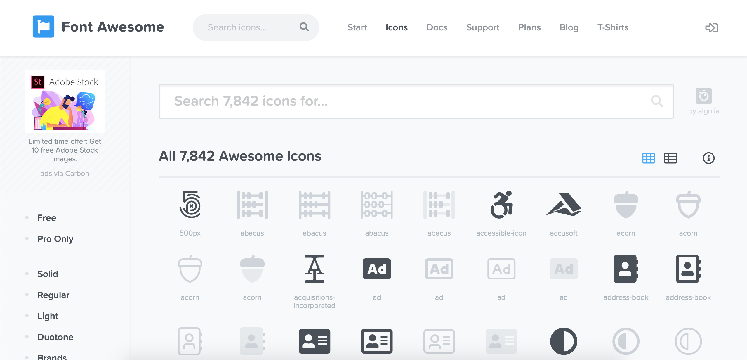
Font Awesome provides a large library of icons to use on your project.
Credit:
Font Awesome
Colors
A color scheme is one of the strongest elements of brand identity but choosing a good palette can be challenging.
The NIAID Design System has simplified color decisions by defining a set of global colors that all NIAID properties should use. By sharing these colors across all platforms, NDS gives digital assets a sense of consistency and familiarity.
#2F2F2F
Heading
#404B56
Body
#246CD3
Link
#6F57B5
Visited Link
#20558A
NIAID Color
#9AA6B5
Placeholder
#FDFDFD
Page Background
#F5F6FA
Page Background Alt
#6D6D6D
Input & Link Border
#D5D5D5
Border Light
While consistency is an overall goal with any design system, customizability is one area where typical design systems fall short. There is a need for various web properties to have their own personality, and this necessitates variance. The NIAID Design System was created to allow users choice in one of three themes. By keeping the global colors consistent, and by applying theme colors selectively and thoughtfully, digital platforms using NDS will both comply with NIAID's brand and express individuality.
Theme 1 (Default):
#157B8D
Primary
#497951
Secondary
#262626
Tertiary
#75C3AC
Accent
Theme 2:
#586FAB
Primary
#247BA0
Secondary
#244D56
Tertiary
#FAB952
Accent
Theme 3:
#14675A
Primary
#423E63
Secondary
#123B56
Tertiary
#79A9D1
Accent
The accent color in each palette does not have sufficient contrast against white for accessibility and is provided only as a means of enhancing visual interest, not to convey meaningful information.
Developing with NIAID Design System Colors
Get more information on how to implement NDS color palettes.
Develop with ColorsForms & Input
Form controls and inputs are essential mechanisms for websites and applications to get user-provided information. From "Was This Page Helpful?" forms to Contact Us pages, form fields and inputs add a layer of interactivity to digital platforms. Form fields can be difficult to get right due to stringent requirements under Section 508 of the Americans with Disabilities Act (ADA). NDS ensures form fields are compliant and elegant by ensuring visible focus states and color contrast meet the guidelines.
Buttons
NDS supports four main button styles: Primary, Secondary, Tertiary, and Negative. These four styles are shown below:
In addition to the main styles, NDS also has a pattern specifically for buttons that link to external sites. For more information on buttons, please visit the Components page.
Text Input Fields
Error with Entry.
Error with Entry.
Error with Entry.
Error with Entry.
Checkboxes & Radio Buttons
Error with Entry.
Error with Entry.
Layout & Spacing
Layout
Web pages are built using a 12-column grid system, provided under the Bootstrap 4 framework. To learn more about the Bootstrap 4 grid system, visit the official Bootstrap 4 grid system documentation.
NDS websites will typically have a main content area that occupies eight or nine Bootstrap columns out of 12. This configuration allows for a side rail of content, such as a section for local navigation, but this is not required.
Spacing & Sizing
NDS is governed by an 8-point grid system. In general, items are spaced by some factor or multiple of eight. Keeping elements spaced in this way helps to promote and maintain visual consistency. All sizing of elements should be done using the "rem" unit to maintain relative scalability.
NDS has provided a set of design tokens for sizing and spacing, similar to Bootstrap and USWDS, to make it easier to use standardized spaces and sizes. These tokens can be used in the form of classes or can be used in Sass as variables. The classes structure uses the following format: {property}-{sides}-{size}-{interval}.
{property} - Type of CSS property:
m- marginp- paddingh- heightw- width
{sides} - Side to apply spacing (optional):
t- topb- bottoml- leftr- rightx- left and righty- top and bottom
Note: Specifying {sides} is not required. If this value is omitted for margin or padding, the style will be applied to all sides (Example: .m-3 -> margin: 3rem).
{size} - Token unit of spacing. The following table shows the available size values:
| Size (Token) Value | Sample |
|---|---|
| 1px | |
| 2px | |
| 1 | |
| 2 | |
| 3 | |
| ... | ... |
| 10 |
{interval} - Token partial spacing (optional):
25- An additional .25rem50- An additional .5rem75- An additional .75rem
Examples: .m-0-50.p-x-5-75
Sizing & Spacing in SASS
All token spacing/sizing values can be used in SASS as variables using the following syntax: $s-{size}-{interval}. Similarly to the classes, the -{interval} value is optional.
Shadows
Shadows are a popular effect in modern web design and there are several different philosophies that govern their usage.
As part of the personalization effort, the NIAID Design System allows users to choose between a flat or shadowed design.
Flat Design
Flat Design is the practice of designing web pages without the use of shadows. Under this paradigm, users rely predominately on color to determine the importance of web components and which areas of the page require their attention.
Shadowed Design
Shadowed design creates visual hierarchy by highlighting elements of greater importance with shadowing. Not only does this strategy provide visual interest by adding a 3D effect to the design, it also ensures users are focusing on the right content.
Developing with NIAID Design System Shadows
Get more information about how the NIAID Design System supports development with flat or shadowed design.
Develop with ShadowsCorners
Another type of design customizability that NDS provides is the roundness of corners, otherwise known as "border-radius." NDS provides three options: sharp, semi-rounded, and fully-rounded. The squares below show how each of these three options is applied in practice.
Sharp
0rem
0px
0px
Semi-Rounded
.3125rem
5px
5px
Fully-Rounded
1rem
16px
16px
Ask Questions, Report Issues, Stay Informed
For questions about the NIAID Design System or to report issues, please visit the Issues tab of the NDS repository on GitHub. To get updates on NDS features and changes, please add yourself as a "Watcher" on the NDS GitHub repository.
NDS on GitHub